Forecasting of Covid-19 Spread

Analysing, Visualising, and Forecasting of Covid-19 Spread in India Using Python
Currently, there is a lot of visualization and statistics available about the Coronavirus spread all over the internet. With so much information and expert opinions, It is difficult to analyze the information and its impact on situations. For example, different nations are adopting different strategies to implement lockdowns, following social distancing norms in affected areas, and so on. There is no straight solution available to resolve the current situation as it also depends on many other factors to handle the situation carefully. This article is an attempt of forecasting and analyze Coronavirus (COVID-19) spread in India.
Introduction
Coronavirus is an RNA (Ribonucleic acid)virus consisting of positive-sense single-stranded RNA of approximately 27–32 kb. Coronavirus belongs to the family Coronaviridae, which comprises of alpha, beta, delta, and gamma coronaviruses. The virus is known to infect a wide range of hosts including humans, other mammals, and birds. In India, 1.34 billion people have been following lockdown, maintaining social distancing and other precautions as per guidelines issued by Government of India. Therefore, I have tried to cover impact of COVID-19 on Indian population.
Objective
The objective of this article is to get the required data for analysis and gain visibility on COVID-19 by enabling the gathering of all relevant data.
Table of Contents
- Technical Prerequisites
- Gather COVID-19 Data
- State Wise Mortality Rate In India
- State Wise Analysis Before and After Lockdown
- Active Case Forecasting
- Confirmed Case Forecasting
Prerequisites
- Have Python 3.1 or above version installed
- Install Pandas, Plotly, Maltplotlib, Scikit-learn
Gather COVID-19 data
With various attempt to clamp down the effect of COVID-19 on the world, various research works and innovative measures depends on insights gained from the right data, so i decided to use Covid19India API, below is the code for fetching state wise details from the api.
import numpy as np
import pandas as pd
import matplotlib.pyplot as plt
import plotly.graph_objects as go
import plotly.express as px
pd.set_option('display.max_rows', None)
import datetime
from plotly.subplots import make_subplots
from scipy.optimize import curve_fit
import warnings
warnings.filterwarnings("ignore")
latest = pd.read_csv('https://api.covid19india.org/csv/latest/state_wise.csv')
state_wise_daily = pd.read_csv('https://api.covid19india.org/csv/latest/state_wise_daily.csv')
state_wise_daily = state_wise_daily.melt(id_vars=['Date', 'Status'], value_vars=state_wise_daily.columns[2:], var_name='State', value_name='Count')
state_wise_daily = state_wise_daily.pivot_table(index=['Date', 'State'], columns=['Status'], values='Count').reset_index()
state_codes = {code:state for code, state in zip(latest['State_code'], latest['State'])}
state_codes['DD'] = 'Daman and Diu'
state_wise_daily['State_Name'] = state_wise_daily['State'].map(state_codes)
state_wise_daily=state_wise_daily[state_wise_daily.State_Name!="Total"]
state_wise_daily['Date'] = pd.to_datetime(state_wise_daily['Date'], dayfirst=True)
state_wise_daily.sort_values('Date', ascending=True,inplace=True)
Above code, specified below details
- 2 sources of Data latest and state_wise_daily
- Mapped State code with State Names
- Aggregated and sorting of data day wise
So now we have the aggregated day by day states number of confirmed , deceased and recovered cases.
State Wise Mortality Rate in India
For finding Mortality Rate per 100 people use below code.
state_wise=state_wise_daily.groupby("State_Name").sum().reset_index()
state_wise["Mortality Rate Per 100"] =np.round(100*state_wise["Deceased"]/state_wise["Confirmed"],2)
state_wise['Mortality Rate Per 100'] = state_wise['Mortality Rate Per 100'].fillna(0)

state_wise.sort_values(by='Mortality Rate Per 100',ascending=False).style.background_gradient(cmap='Blues',subset=["Confirmed"])\
                        .background_gradient(cmap='Greens',subset=["Recovered"])\
                        .background_gradient(cmap='Reds',subset=["Deceased"])\
                        .background_gradient(cmap='YlOrBr',subset=["Mortality Rate Per 100"]).hide_index()
Above we have aggregated sum data for the states and for finding mortality rate, we divide deceased case with confirmed case and after running the code you will find below output
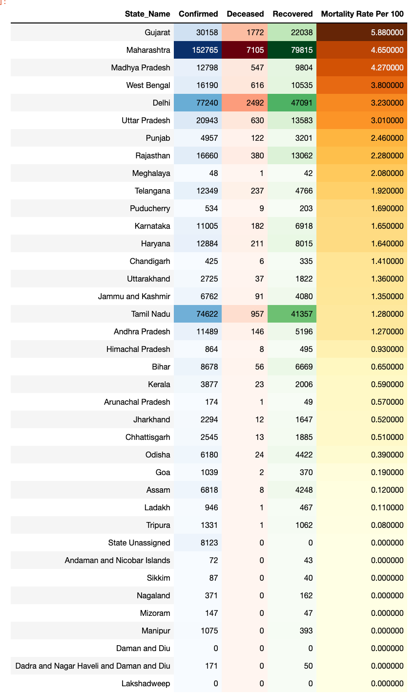
From the output we can analyse that Gujarat, Maharashtra and Madhya Pradesh are the major state where in each 100 confirmed cases of Covid-19 approx. 5 cases coming under deceased.
State wise analysis Before and after Lockdown
For doing state wise analysis , analysed the first phase of lockdown period started from 24-Mar-2020 to 24-Apr-2020 . Below are few snaps for state wise trend.
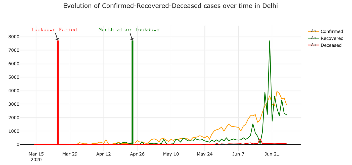
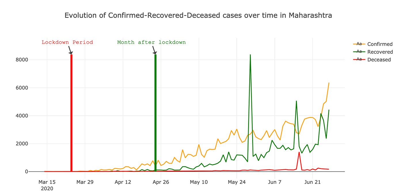
It’s interesting that how after lockdown recovered and confirmed cases are increasing in similar pattern for all the states .You can use below code to get above visualisation.
def stanalysis(statename,typ):
    definestate=state_wise_daily[state_wise_daily.State_Name==statename]
    finalstate= definestate.groupby(["Date","State_Name"])[["Confirmed","Deceased","Recovered"]].sum().reset_index().reset_index(drop=True)
    createfigure(finalstate,typ,statename)

def createfigure(dataframe,typ,statename):
    fig = go.Figure()
    fig.add_trace(go.Scatter(x=dataframe["Date"], y=dataframe["Confirmed"],
                    mode="lines+text",
                    name='Confirmed',
                    marker_color='orange',
                        ))

    fig.add_trace(go.Scatter(x=dataframe["Date"], y=dataframe["Recovered"],
                    mode="lines+text",
                    name='Recovered',
                    marker_color='Green',
                        ))
    fig.add_trace(go.Scatter(x=dataframe["Date"], y=dataframe["Deceased"],
                    mode="lines+text",
                    name='Deceased',
                    marker_color='Red',
                        ))

    fig.add_shape(
        # Line Vertical
        dict(
            type="line",
            x0="2020-03-24",
            y0=dataframe[typ].max(),
            x1="2020-03-24",

            line=dict(
                color="red",
                width=5)))
    fig.add_annotation(
            x="2020-03-24",
            y=dataframe[typ].max(),
            text="Lockdown Period",
             font=dict(
            family="Courier New, monospace",
            size=14,
            color="red"
            ),)
    fig.add_annotation(
            x="2020-04-24",
            y=dataframe[typ].max(),
            text="Month after lockdown",
             font=dict(
            family="Courier New, monospace",
            size=14,
            color="Green"
            ),)
    fig.add_shape(
        # Line Vertical
        dict(
            type="line",
            x0="2020-04-24",
            y0=dataframe[typ].max(),
            x1="2020-04-24",

            line=dict(
                color="Green",
                width=5)))
    fig
    fig.update_layout(
    title='Evolution of Confirmed-Recovered-Deceased cases over time in '+statename,
        template='gridon')
    fig.show()

    #if you want to get only one state result
    stanalysis("Gujarat",'Recovered')
    #For all states run below code
    for states in state_wise_daily.State_Name.unique().tolist():
    if(states!='Daman and Diu'):
        stanalysis(states,'Recovered')
Now, we will aggregate the confirmed cases day count wise to get the visual representation.

Since the first identified case of Covid-19 in India, we are now on 104th day and analysis shows that the bar is increasing day by day. Below is the code for getting above visualisation.
population=state_wise_daily.groupby(["Date"])[["Confirmed","Deceased","Recovered"]].sum().reset_index()
population["day_count"]=list(range(1,len(population)+1))
fig = px.bar(population, x='day_count', y='Confirmed',text='Confirmed')
fig.update_traces(texttemplate='%{text:.2s}', textposition='outside')
fig.update_layout(
xaxis_title="Day",
yaxis_title="Population Effected",
title='Evaluation of Confirmed Cases In India',template='gridon')
fig.show()
Instead of dwelling on the exact numbers, the takeaway message from below forecasting is that we can draw a meaningful analysis and take pre-actions .
Active Case Forecasting

Analysis shows that daily Active cases in India is approx. 4524 and on day 52 the curve stopped steepening and started flatten , curve will flatten till day 130 which is 22 July 2020 . Also, On 31 July 2020 , India have approx 360848 Active cases of Covid-19. You can use below code for getting above analysis before that lets understand sigmoid function in our scenario.
Sigmoid Function
From small beginnings that accelerates and approaches a climax over time, When a specific mathematical model is lacking, a sigmoid function is often used. So in our case sigmoid function is y = c/(1+np.exp(-a*(x-b))) where
c — Maximum value (Maximum Infected people from Virus)
a — Sigmoidal shape (how the infection progress)
b — Point where sigmoid start to flatten
Below is the code for sigmoid function and Active Case Forecasting
def sigmoid(x,c,a,b):
    y = c*1 / (1 + np.exp(-a*(x-b)))
return yThe trick to make this understanding that this is not an actual linear process, but an exponential one. We must treat our data accordingly.
indiapopulation=1380004385
fmodel=population[population.Confirmed>=50]
fmodel['day_count']=list(range(1,len(fmodel)+1))
fmodel['increase'] = (fmodel.Confirmed-fmodel.Confirmed.shift(1)).fillna(0).astype(int)
fmodel['increaserate']=(fmodel['increase']/fmodel["Confirmed"])
fmodel['Active']=fmodel['Confirmed']-fmodel['Deceased']-fmodel['Recovered']

xdata = np.array(list(abs(fmodel.day_count)))
ydata = np.array(list(abs(fmodel.Active)))
cof,cov = curve_fit(sigmoid, xdata, ydata, method='trf',bounds=([0.,0., 0.],[indiapopulation,1, 100.]))

x = np.linspace(-1, fmodel.day_count.max()+20, 20)
y = sigmoid(x,cof[0],cof[1],cof[2])

fig = go.Figure()
fig.add_trace(go.Scatter(x=x, y=y,
                    mode="lines+text",
                    name='Active Cases Approx',
                    marker_color='orange',
                        ))

fig.add_trace(go.Scatter(x=xdata, y=ydata,
                    mode="markers",
                    name='Active Cases',
                    marker_color='Green',
                    marker_line_width=2, marker_size=10
                        ))
fig
fig.update_layout(
title='Daily Active Cases in India is approx '+ str(int(cof[0])) +', Active cases curve started flatten from day ' + str(int(cof[2])) +" and will flatten by day "+str(round(int(cof[2])*2.5)),
        template='gridon', font=dict(
        family="Courier New, monospace",
        size=10,
        color="blue"
    ))
fig.show()

#Total Active Case
print(round(fmodel.Active.sum()+((fmodel.day_count.max()+40-fmodel.day_count.max())*y[11:20].mean())))Confirmed Case Forecasting
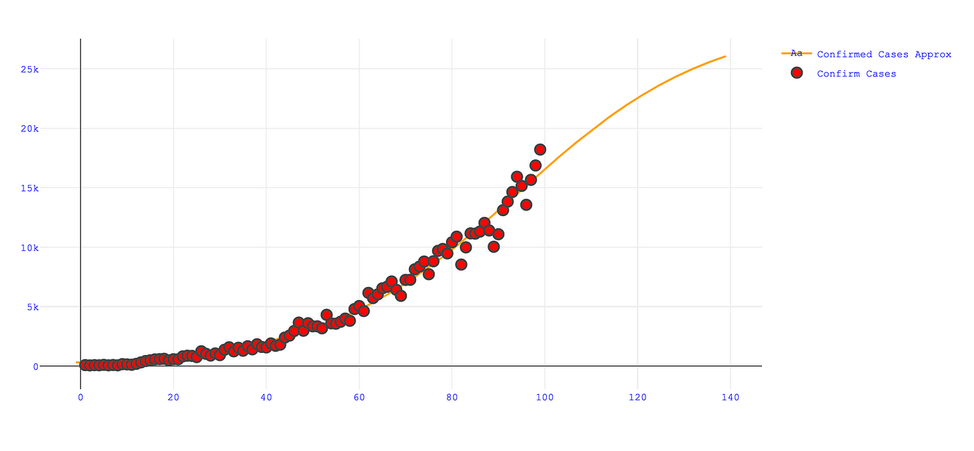
Daily Confirmed cases in India is approx. 29115 and on day 94 the curve stopped steepening and started flatten , curve will flatten till day 245 which is 14 November 2020. Also, On 31 July 2020 , India have approx. 1276800 Confirmed cases of Covid-19. You can use below code for getting above analysis.
xdata = np.array(list(abs(fmodel.day_count)))
ydata = np.array(list(abs(fmodel.Confirmed)))
cof,cov = curve_fit(sigmoid, xdata, ydata, method='trf',bounds=([0.,0., 0.],[indiapopulation,1, 100.]))
#‘trf’ : Trust Region Reflective algorithm, particularly suitable for large sparse problems with bounds. Generally robust method.

x = np.linspace(-1, fmodel.day_count.max()+40, 40)
y = sigmoid(x,cof[0],cof[1],cof[2])


fig = go.Figure()
fig.add_trace(go.Scatter(x=x, y=y,
                    mode="lines+text",
                    name='Confirmed Cases Approx',
                    marker_color='Orange',
                        ))

fig.add_trace(go.Scatter(x=xdata, y=ydata,
                    mode="markers",
                    name='Confirm Cases',
                    marker_color='Red',
                    marker_line_width=2, marker_size=10
                        ))
fig
fig.update_layout(
title='Daily Confirmed Cases in India is approx '+ str(int(cof[0])) +', Confirm case curve started flatten from day ' + str(int(cof[2])) +" and will flatten by day "+str(round(int(cof[2])*2.5)),
        template='gridon',
 font=dict(
        family="Courier New, monospace",
        size=7,
        color="blue"
    ))
fig.show()

#Total Confirmed Case
print(round(fmodel.Confirmed.sum()+((fmodel.day_count.max()+40-fmodel.day_count.max())*y[21:40].mean())))
I hope this article aid furtherance of research works. Thanks for reading.
Stay safe!
References
Covid19India.org
Identification of Coronavirus Isolated from a Patient
